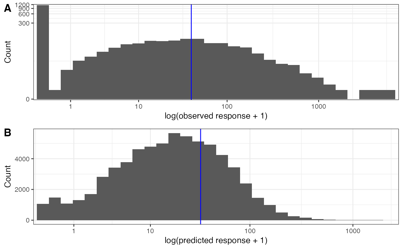
Compares the distribution of the observed response with the distribution of
predicted values over the prediction grid, on a log1p x-axis, with the means
marked. Blue lines indicate mean values.
Arguments
- fit
A fitted
sdmTMB::sdmTMB()model (for the observed response).- pred
A prediction data frame from
predict(fit, newdata = ...).- response
Character. Name of the response column in the model data. If
NULL(default), taken from the model formula.- column
Character. Predicted column in
pred. Default"est".- base_size
Numeric. Base font size. Default
11.
Examples
# \donttest{
mesh <- sdmTMB::make_mesh(sdmTMB::pcod, c("X", "Y"), cutoff = 20)
m <- sdmTMB::sdmTMB(
density ~ 0 + as.factor(year), data = sdmTMB::pcod, time = "year",
mesh = mesh, family = sdmTMB::tweedie()
)
nd <- sdmTMB::replicate_df(sdmTMB::qcs_grid, "year", unique(sdmTMB::pcod$year))
pred <- predict(m, newdata = nd, type = "response")
plot_prediction_histogram(m, pred)
 # }
# }