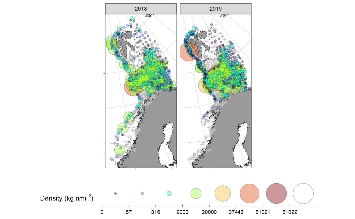
Draws a bubble map of a response variable (e.g. catch density) over a
ggOceanMaps::basemap(): zero observations are shown as small crosses and
positive observations as size- and colour-scaled circles. Useful for a quick
overview of survey data before modelling.
Usage
bubble_map(
  x,
  response = "value",
  label = expression(paste("Density (kg ", nmi^-2, ")")),
  zero_color = "grey",
  point_stroke = 0.3,
  ncol = 6,
  by_year = TRUE,
  filled_circles = TRUE,
  axis_text = FALSE,
  axis_title = FALSE,
  legend_rows = 1,
  base_size = 10
)
Arguments
- x
A data frame with longitude/latitude columns (auto-detected by
ggOceanMaps::guess_coordinate_columns()), a year column, and a response column (seeresponse).- response
Character. Name of the response column. Default
"value".- label
Fill/size legend label. Default an expression for density.
- zero_color
Colour for zero observations. Default
"grey".- point_stroke
Numeric point stroke width. Default
0.3.- ncol
Integer. Number of facet columns when
by_year = TRUE. Default6.- by_year
Logical. Facet by year? Default
TRUE.- filled_circles
Logical. Use filled circles (
TRUE, default) or coloured outlines?- axis_text, axis_title
Logical. Show axis text / titles? Default
FALSE.- legend_rows
Integer. Number of legend rows. Default
1.- base_size
Numeric. Base font size. Default
10.